Product Design

Design System Rebuild

Broken House being rebuilt

The Problem: Bloated Project Timelines

We had a unmaintained Design System for our software tooling. This led to inconsistencies and inefficient work flows. Eventually the gap in consistency grew larger and larger, leading to usability issues and a slower workflow between design and dev. It was important to repair this as we were moving from Nuxt 2 framework to Nuxt 3 framework, and this was probably our only chance. We also would be selling this software to other companies, meaning it had to be more usable.

Success Metrics:

We would measure success through attempting to achieve these metrics:

25%

Decrease in time spent creating tooling

4 / 5

Overall Dev & Design Satisfaction

4 / 5

Software User Satisfaction & Usability

80%

Pass on WCAG AA Standards

Project Details

Project Type

Design system rebuild

Timeframe

4 weeks for core work

Tools Used

Figma, Storybook, Confluence, Supernova

UX Practices

Usability testing, audit, atomic level systems, tokens, documentation, accessibility

Analysis/ Research

Group Workshop: Discovering our Current Problem

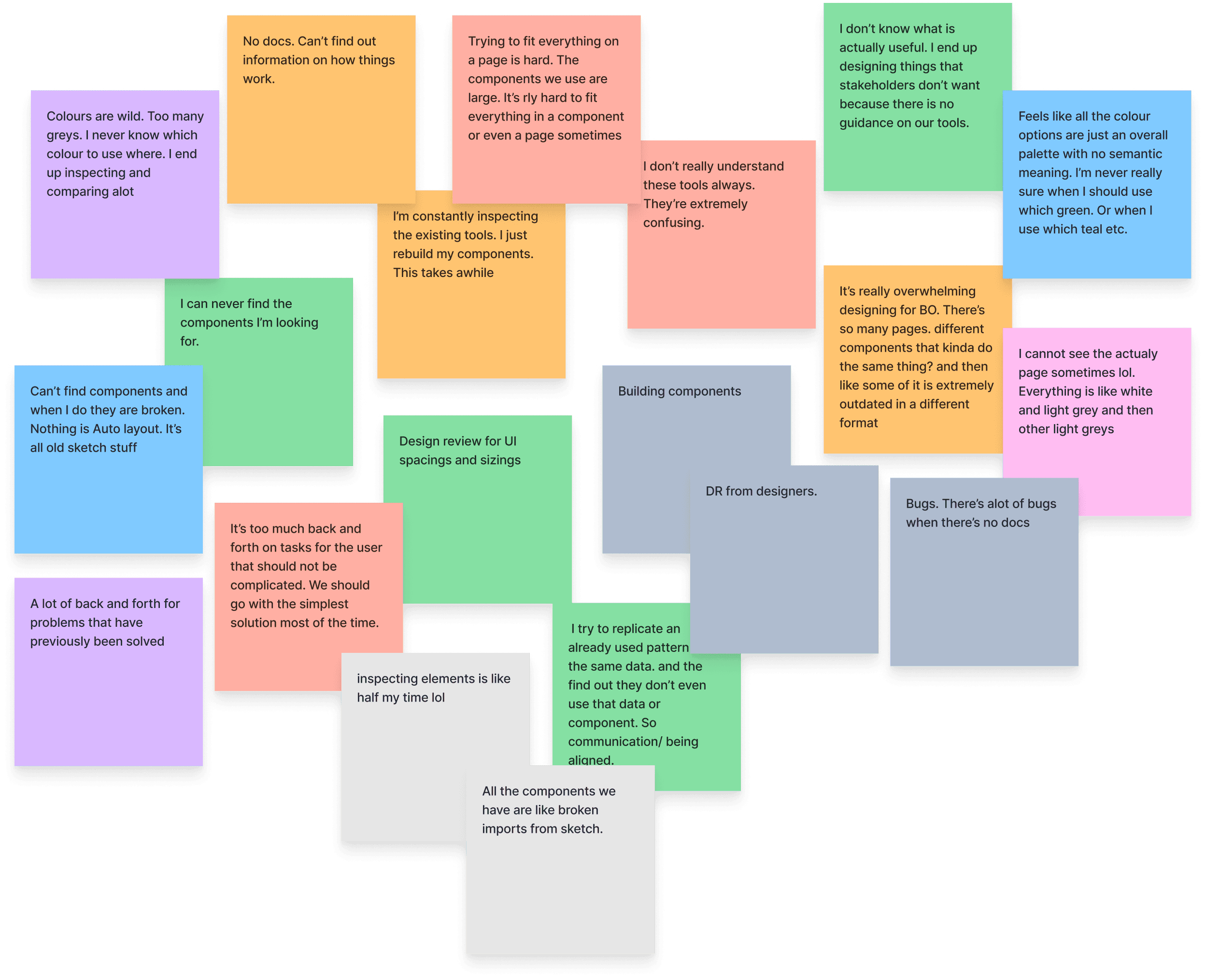
We held an online jam session with devs and designers to understand blockers in their workflow, and what was slowing them down.

Sticky notes from a group workshop

We Found These Blockers:

• Finding components

• The time it takes to rebuild lost components

• Not knowing when to use certain components

• Component sizing wasn’t compact enough

• Colour contrast/ accessibility

Sticky notes from a group workshop

Group Workshop Learnings

We lacked the ability to empower our devs and designers because of insufficient shared knowledge of patterns.

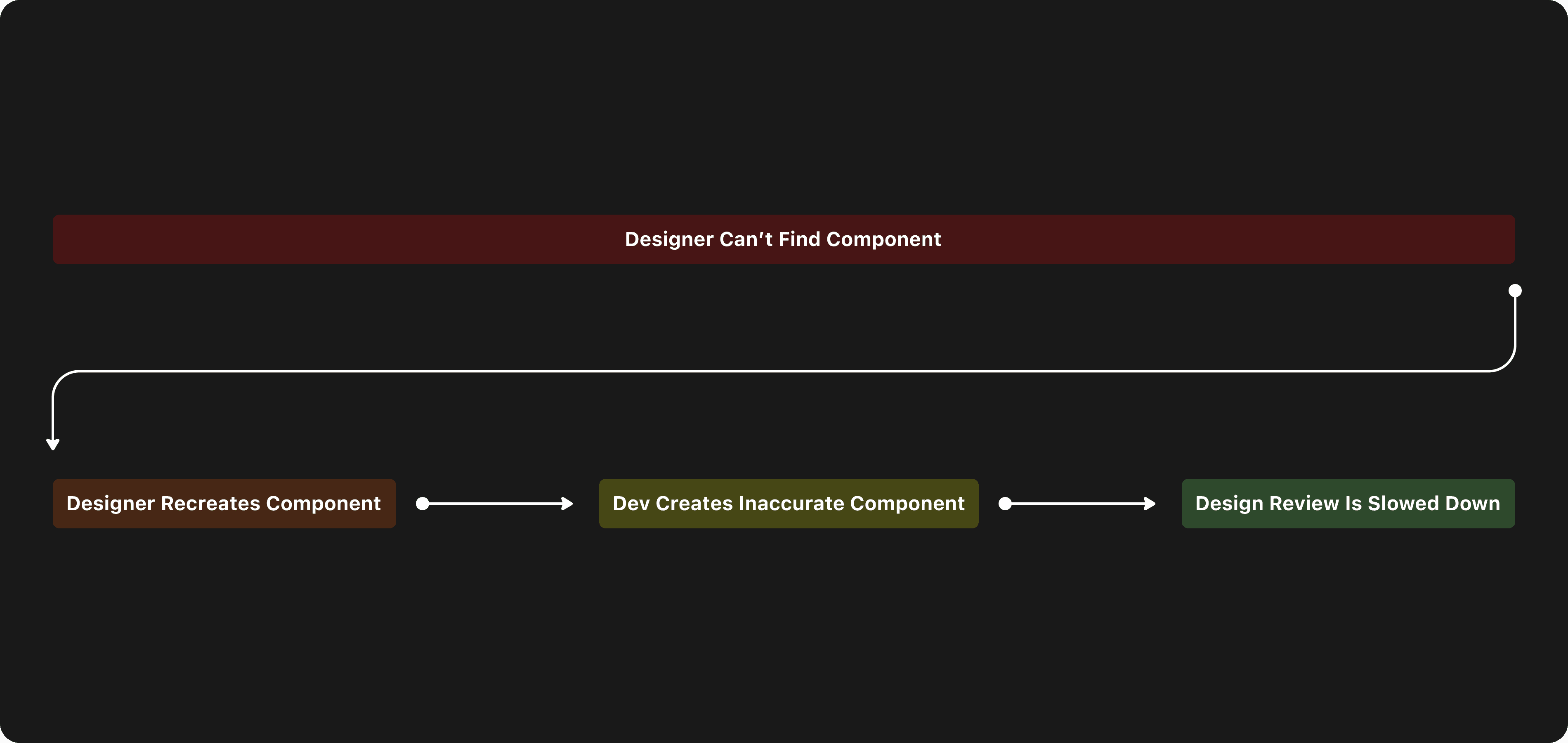
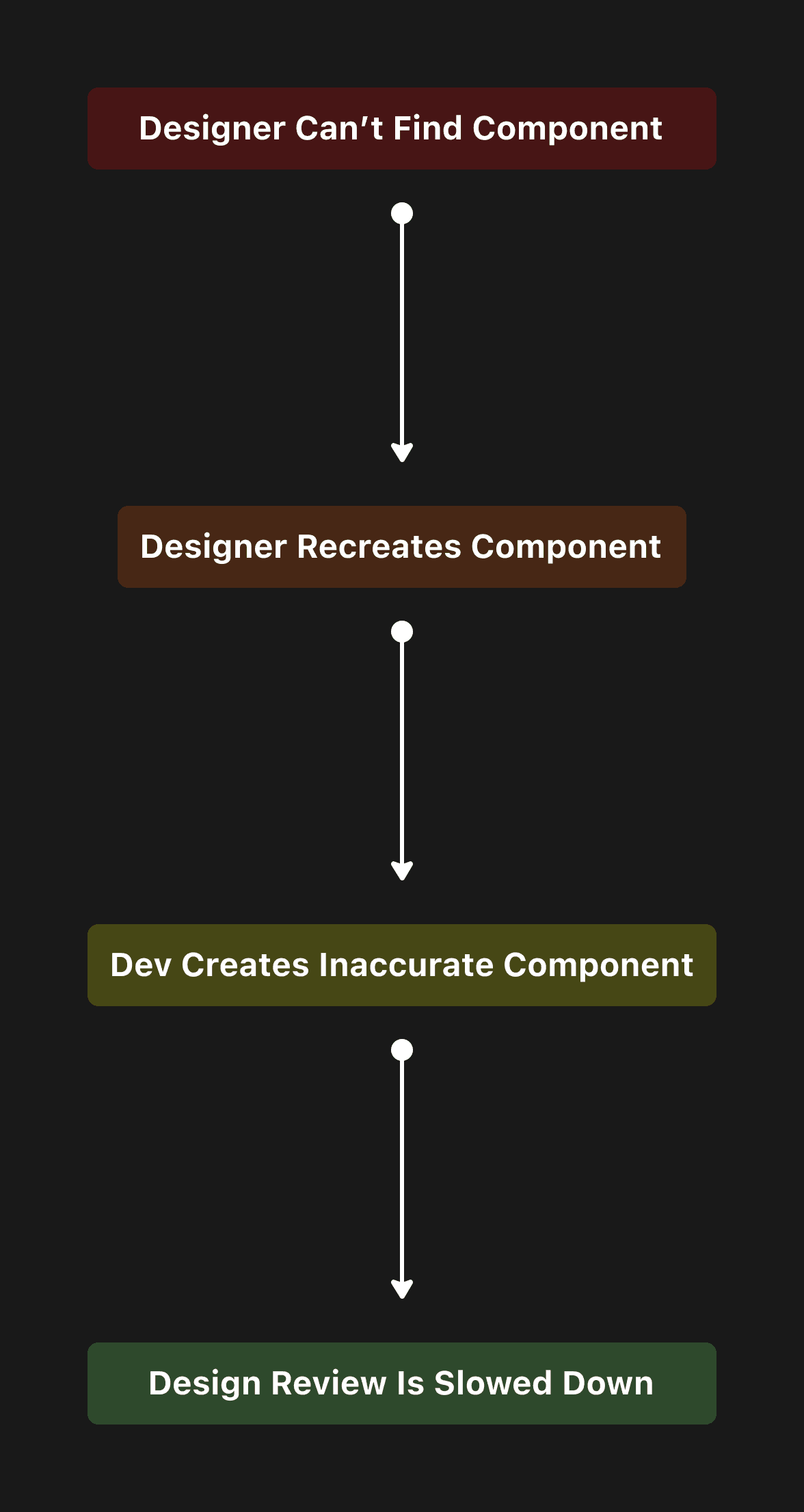
designers can't find components, so they rebuild them. Develops build those components out. Inconsistencies occur.

Measuring Future Success

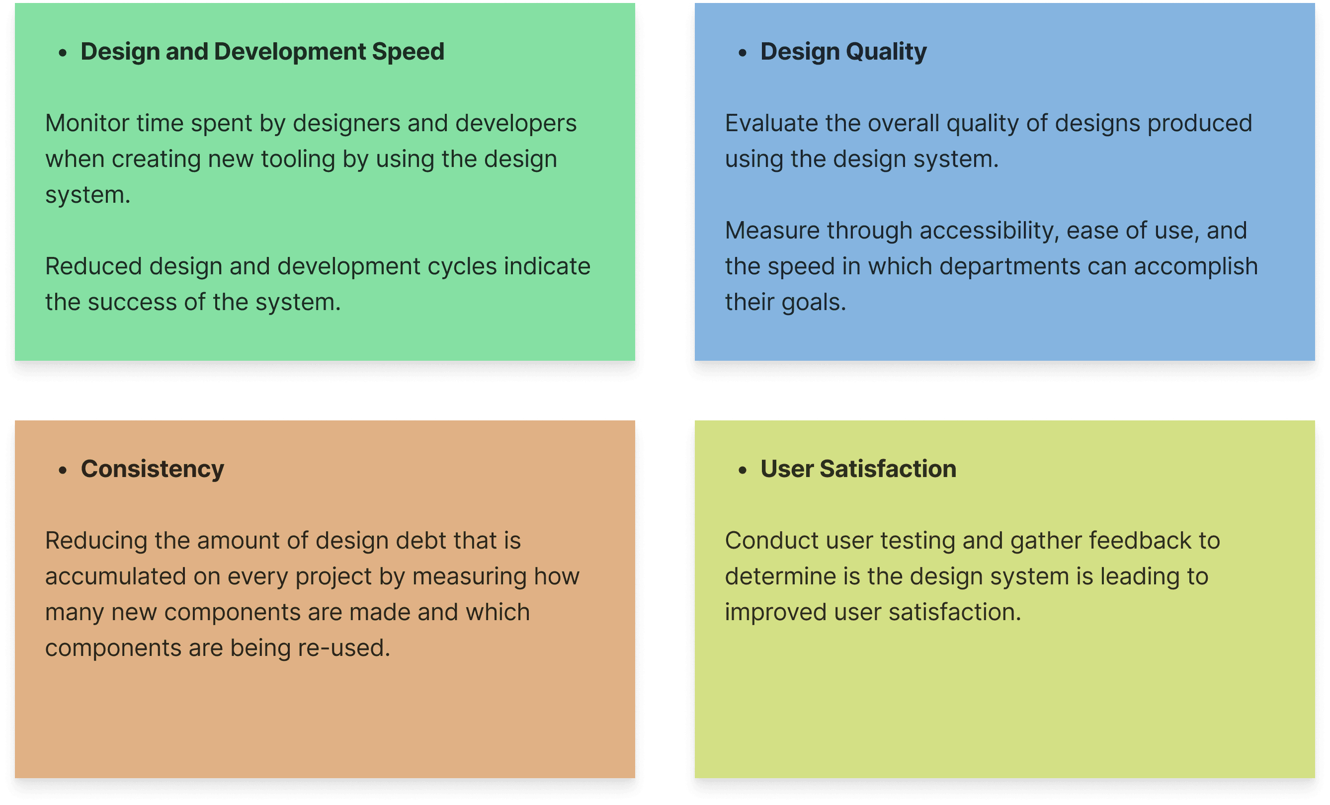
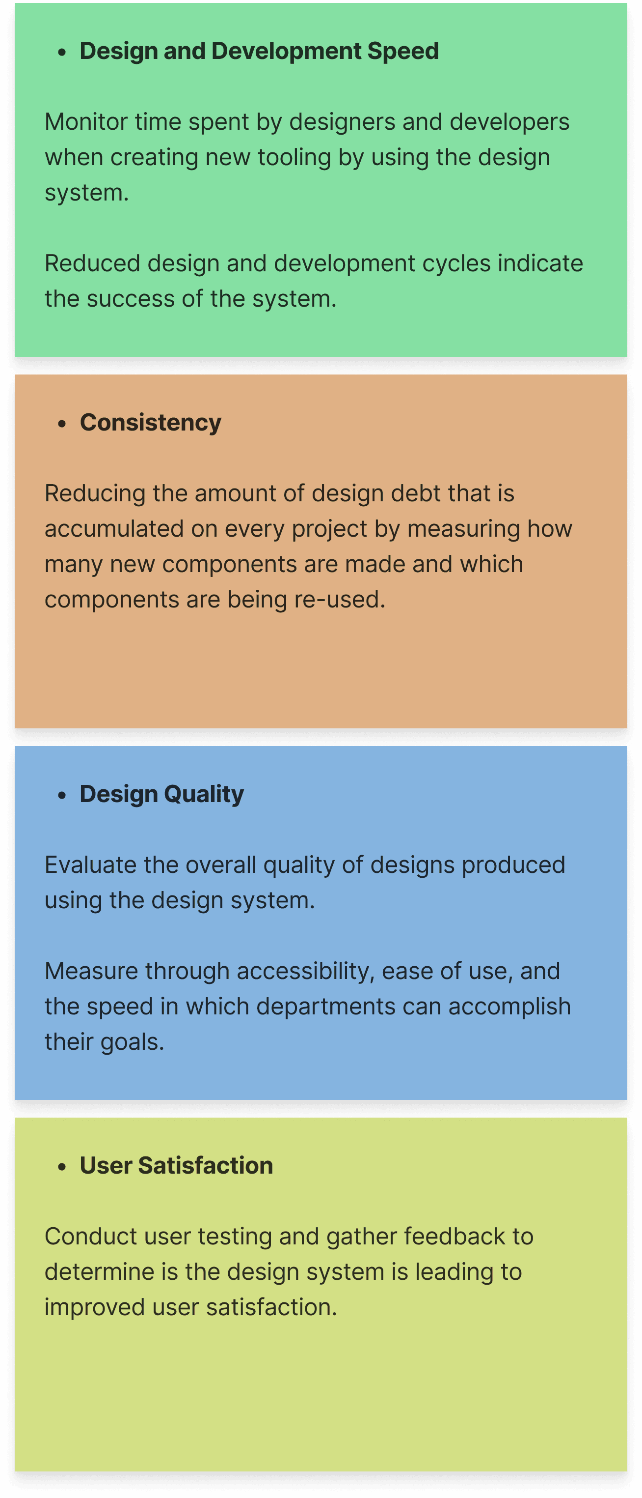
Our main goal: decrease the amount of time spent on creating internal tooling by 25%

Consistency, efficiency, user satisfaction, design quality

Solutions: Tokens, Documentation & Syncing

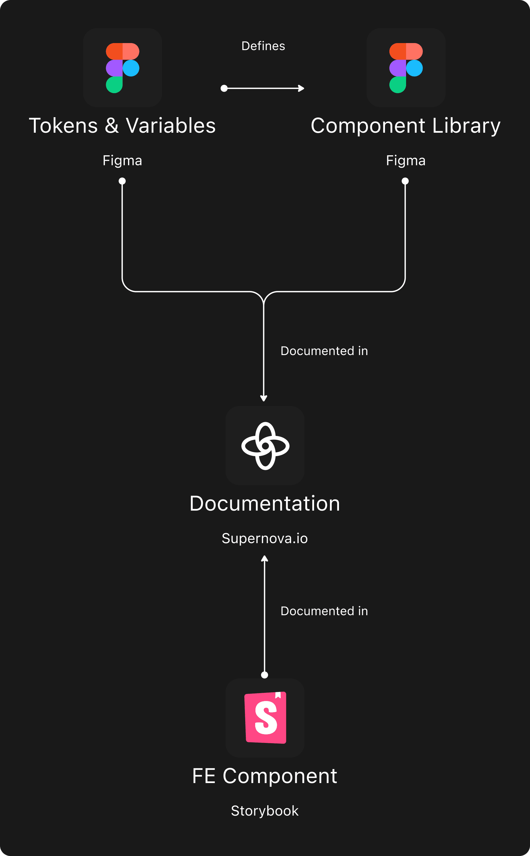
We created one source of truth by syncing multiple tools.

Connecting figma to supernova, and connectin supernova to storybook

Ideation

How we would solve the workshop blockers and reach success:

Redo the design system down to its foundation: typeface, primitives palette, spacing, elevation, etc.

Using tokens to control how changes are made and create consistency between new components and old ones. Create tiers for Tokens.

Create centralized component library and a process for updating & creating components.

Create governance over areas of the new system to ensure updates are made.

Building out documentation that could be synced between design and dev.

Solutions: Tokens, Documentation & Syncing

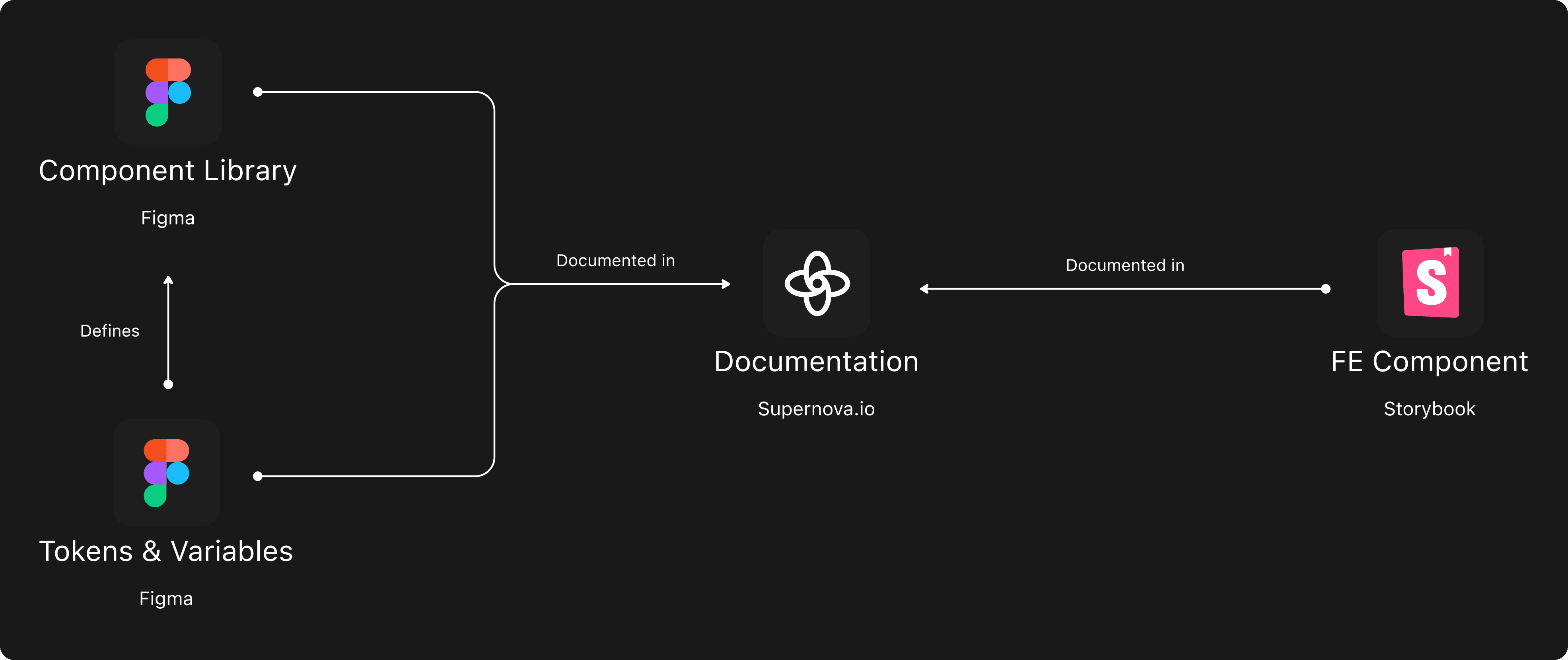
We created one source of truth by syncing multiple tools.

Connecting figma to supernova, and connectin supernova to storybook

Solutions: Design System Foundation

We started with a new design system foundation to address concerns from our group session.

Solutions: Compact Components & Visual Clarity

We created smaller components that still adhered to WCAG AA target size standards.

We reduced visual clutter and increasing visual hierarchy. Below you can see the old version (lightmode). We reduced this components (and many others) used space by 47.4%.

Comparing old components to new components

Solutions: Accessibility & Contrast

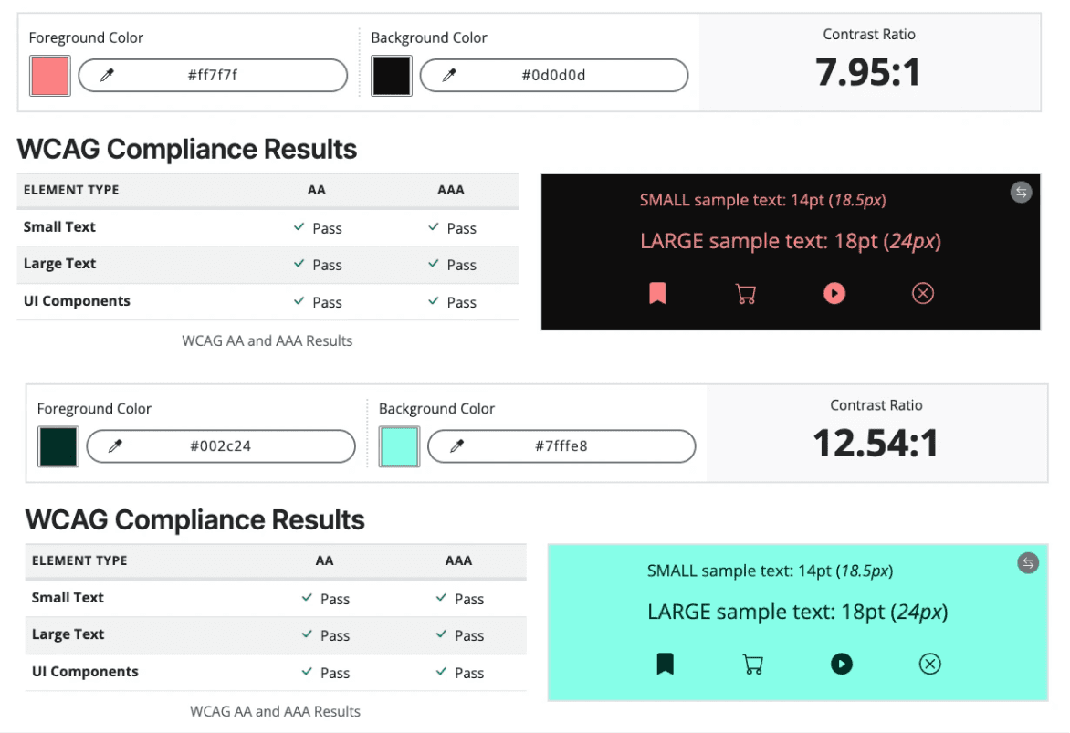
We chose to give our users Dark mode. The reason being that our external user facing site was in dark mode. Our internal users were constantly switching back and forth between the internal tool and the main site. We tested to make sure our new semantic palette met WCAG AAA Standards.

Colour contrast tests

Solutions: Documentation

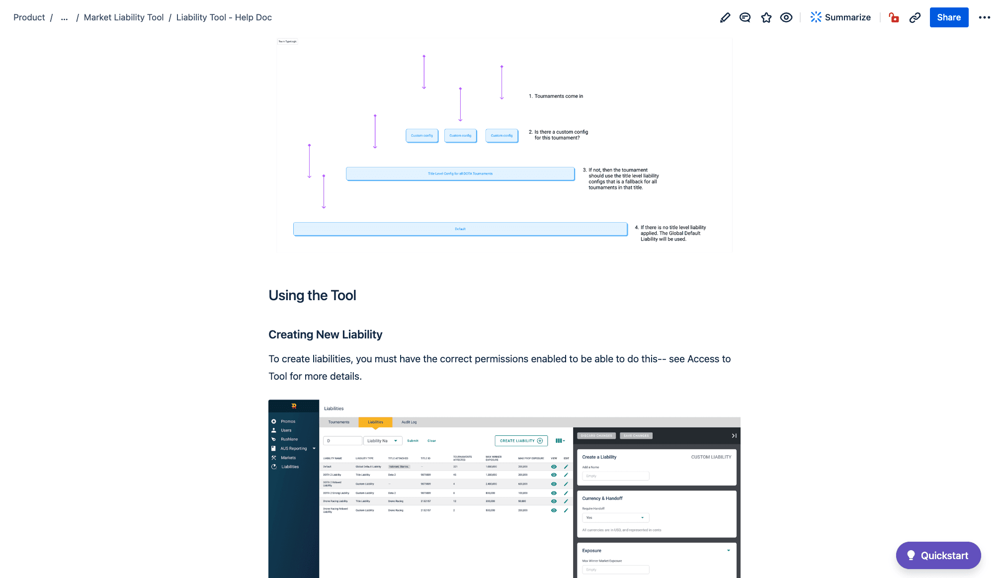
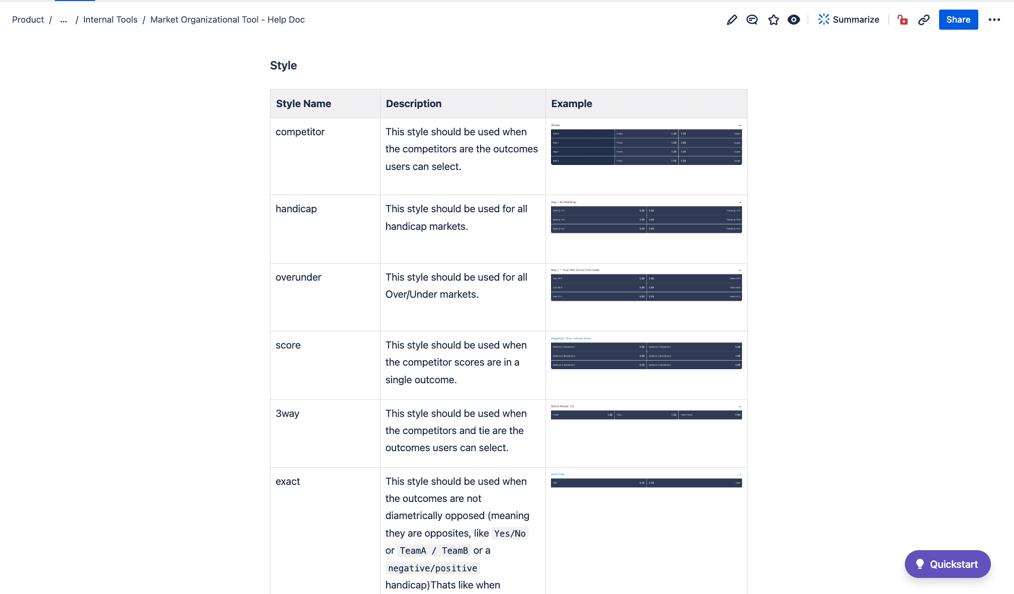
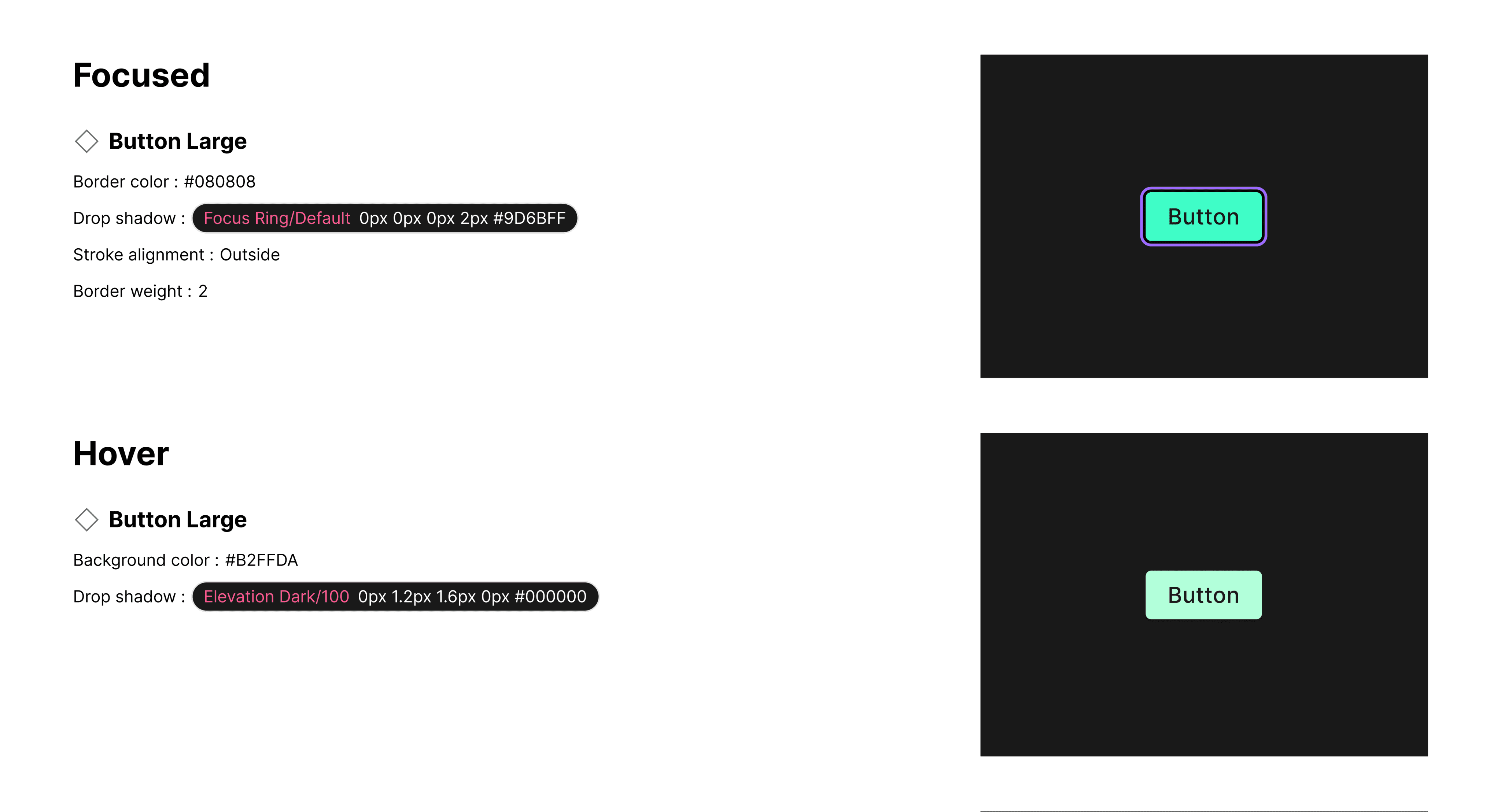
We developed documentation resources and training materials to onboard designers, developers, and other stakeholders to the updated design system. This ended up being the most beneficial part of the system. It helped devs, designers, and PM's to understand problems across all platforms when they would arise. It also decreased knowledge transfer sessions, freeing up more time to really get into deep work.

for functionality
Documentation for when to use a component
Documentation for UI

Results: Measuring ROI

46.2%

Decrease in Design & Dev Time

Monitored the lifetime of JIRA tickets

100%

Pass of WCAG AAA Colour Standards

Measured through WCAG contrast checker

100%

Pass of WCAG AAA Target Size Guidelines

Measured through WCAG suggested sizing

4.8 / 5

Overall Dev & Design Satisfaction

Measured through surveys

5 / 5

Software User Satisfaction & Usability

Measured through surveys

What People Said

These were some of the things that users of the software tools and also colleagues at my work said about my work on this.

"Thank god. No more flashbang." - Adrià (Sportsbook Assistant)

"It's been amazing working with you and your insanely creative brain." - Brad (Senior Product Designer)

"This is how you come up with a full system. Let the man cook!" - David (Director of Product Design)

Learnings

Governance is very important. It became very clear that without it, all this hard work could easily regress.

We found that documentation was even more important than accurate component libraries. Documentation was crucial in sharing knowledge of issues at hand and design patterns in an efficient way. We did use Supernova and Confluence for documentation, but we also found that Figma was great for many people. Figma is very easy to navigate and designers can create screen flows that link out to other pages much easier than the other platforms. It's also nice to have everything in one place. Documentation should feel like something that is helpful, easy to navigate, and not overwhelming. Having documentation sprawled across many platforms can be intimidating for some.

Learnings

We lacked the ability to empower our devs and designers because of insufficient shared knowledge of patterns.

designers can't find components, so they rebuild them. Develops build those components out. Inconsistencies occur.

Measuring Future Success

Our main goal: decrease the amount of time spent on creating internal tooling by 25%

Consistency, efficiency, user satisfaction, design quality

Solutions: Compact Components & Visual Clarity

We created smaller components that still adhered to WCAG AA target size standards.

We reduced visual clutter and increasing visual hierarchy. Below you can see the old version (lightmode). We reduced this components (and many others) used space by 47.4%.

Comparing old components to new components

Solutions: Accessibility & Contrast

We chose to give our users Dark mode. The reason being that our external user facing site was in dark mode. Our internal users were constantly switching back and forth between the internal tool and the main site. We tested to make sure our new semantic palette met WCAG AAA Standards.

Colour contrast tests

Solutions: Documentation

We developed documentation resources and training materials to onboard designers, developers, and other stakeholders to the updated design system.

Solutions: Documentation

We developed documentation resources and training materials to onboard designers, developers, and other stakeholders to the updated design system.

for functionality
for functionality
Documentation for when to use a component
Documentation for UI