Product Design
The Problem: Decreasing NBA Traffic
Our NBA site traffic was decreasing in one of our popular regions (Philippines). Stakeholders wanted us to create a landing page for an online NBA Raffle.
Success Metrics:
We would measure success through attempting to achieve these metrics:
10%
Increase for NBA revenue
5%
Increase for NBA retention
Project Details
Project Type
Landing Page
Timeframe
2 Days! 😨
Tools Used
Figma, Power BI, Google Analytics
UX Practices
Data Analysis, Wireframes, Interaction Design, Hi-fi Mocks
Analyzing Data to Target Results
User Personas and Choosing a Sport
We knew that our millions of users in the Philippines contained a user group that made many bets at low cost. We knew we should target the raffle to be for them. We wanted each bet regardless of bet size, to count as a raffle ticket. We knew from the data that the betting behaviours in this region would be attracted to this concept.
45.5% of our users in PH were "Small bet, large quantity bettors". In addition to that, Basketball made up 60.2% of our betting. So we chose to target it for the raffle over other sports.
User Journey & Page Layout
Wireframes and Large Spacing
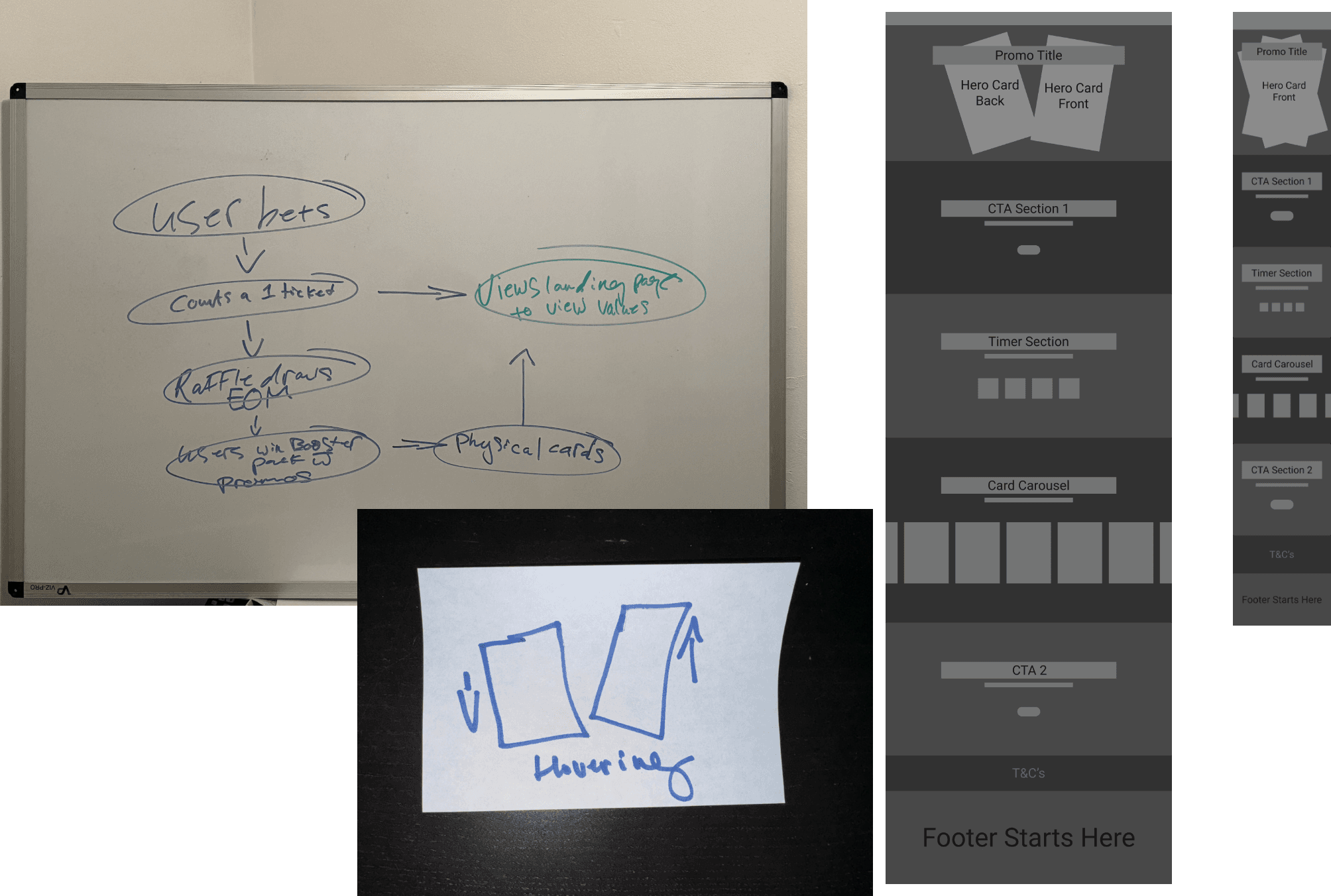
2 Screen states. We went with a large sprawling layout. Also conceptualized a hovering card animation. Worked on user journey as well.
Countdown Timer
Variables & Conditional Statements
I used variables for the minutes and seconds. After this, I wrote conditional statements to create a functioning timer. Yes I could've just sent the devs a timer library, but I wanted to play with the conditionals feature in Figma.
Prototype Preview
A GIF of the working prototype.
SVG Animations
Ideas To Possibly Refine
I came up with a few rough SVG animations that we would potentially develop. We chose to only refine and develop the twinkling star animation. The others felt like they would need too much work for the short time frame. I made a lottie file of the twinkling stars and then extracted the optimized JSON.

Optimized JSON
Carousel
Mobile First Design
Our data shows that 72% of our users are on mobile. This carousel would save us some vertical space.
Holographic Tiltable Cards
Not In Scope
We explored different ideas for the cards in the carousel. For example having cards that showed holographic shine on tilt or hover. This was out of scope.
Hero Container
The trick to creating the floating effect with the cards in Figma is to have the cards rotate by 1° when the reach their final position. The final position should also be a short distance and take 3000ms.
Final Product
Screen Recording
I delivered my design within two days. My dev was set up with a very detailed spec to do their best work. Below is a recording of the final product.
Results: Measuring ROI
22%
Increase in NBA revenue
Measured through Power BI
13%
Increase in NBA retention
Measured through Power BI
What People Said
These were some of the things that colleagues at our company said about my work on this.
"This looks exceptional." - Ryan (CTO)
"This is BEAUTIFUL. Thank you!" - Althea (PH Country Manager)
"Man this is looking so sick, I love this. Most fun thing I've worked on in a while. Just excited to work with someone so good" - Alex (Global Head of Creative)
Learnings
Sometimes when you have less time on a project, it can create a very creative environment. It can create an environment where people don't sweat so much about small details, and trust that the details will get ironed in the process, moving the team along faster. We also cut our losses when exploring animations. We only chose to refine one of the several we worked on. This was interesting because sometimes ideas can be forced into working. What was great about this was that when we did move on, we explored something else that was even cooler. We didn't burn more time on something that just wasn't working.


