Product Design
Software Tooling
Understanding The Problem: Dev Resource Bleed
At Rivalry Corp, there is many webpages that change depending on which state they are in. For example if a basketball match is live, the page will have a different layout than when the match is upcoming. Even the content in the layout is different in each state.
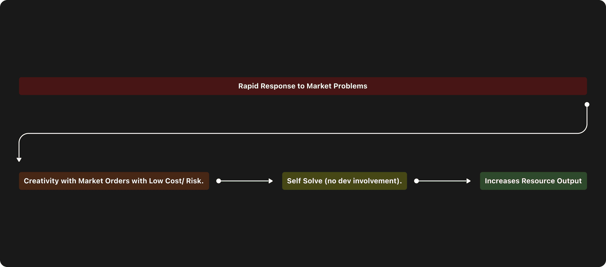
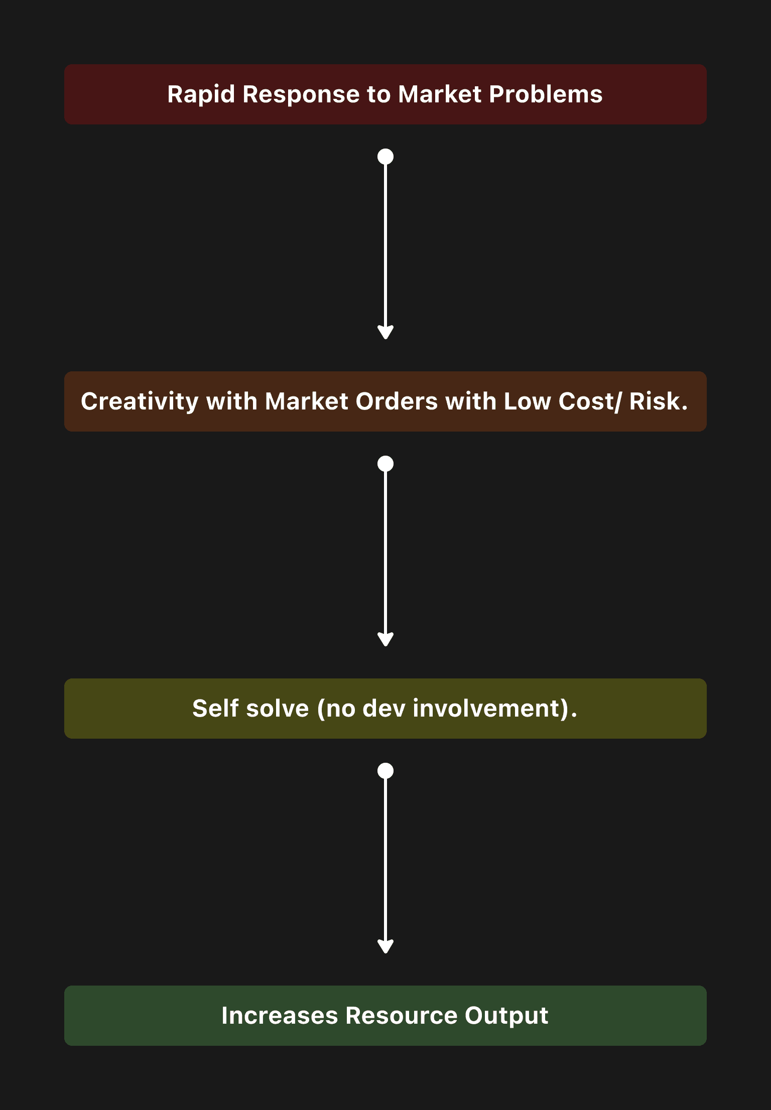
Every time a manager needs to update the layout or content on one of these pages they must contact our Devs to make the adjustments. This uses too many resources for both teams. It also doesn't allow managers to respond quickly to any problems that arise. They must wait for a dev to be available.
Success Metrics:
We would measure success through attempting to achieve these metrics:
50%
Decrease in developer output
4 / 5
Software User Satisfaction
Project Details
Project Type
Data management software design
Timeframe
3 weeks
Tools Used
Figma, JIRA, Confluence
UX Practices
Data research & mapping, usability testing, user journey flows, design systems, wireframes, interactive prototypes, affinity mapping, hi-fi screens
Analysis & Research
Understanding the Back-end Logic
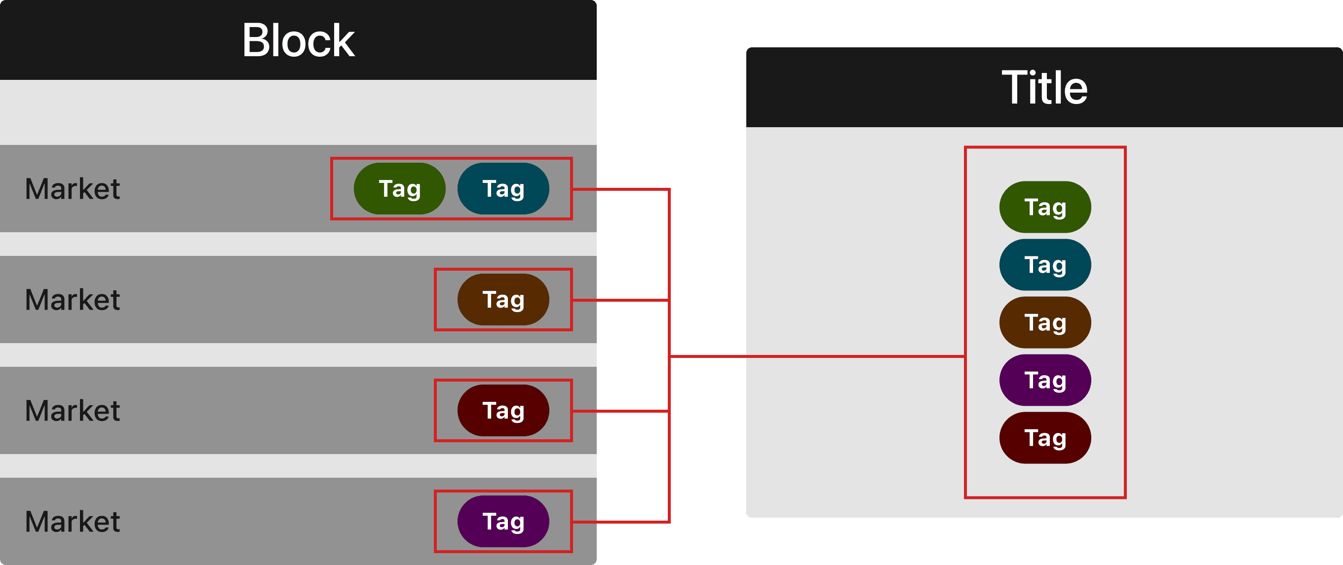
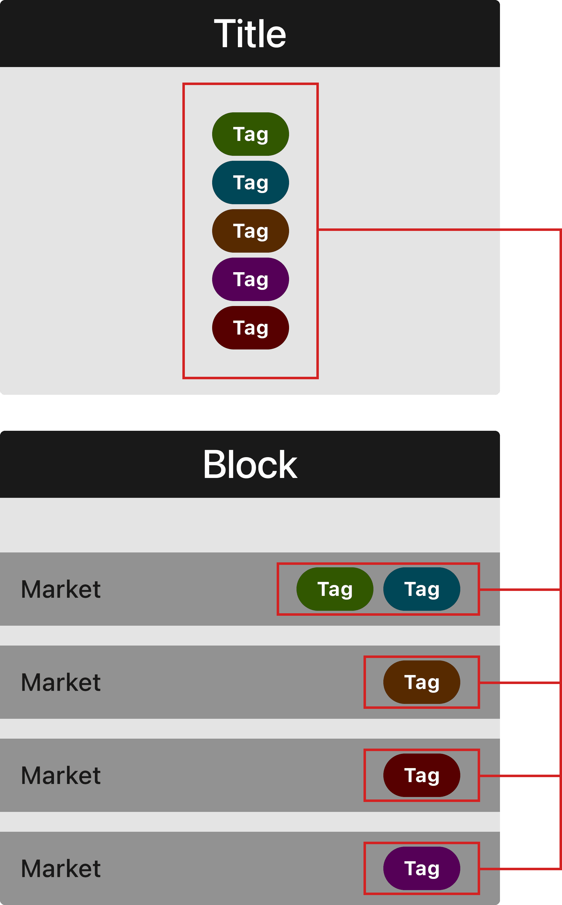
I conducted some research on our systems, and mapped out my findings.
The title makes a call to collect all markets with the same tags that the title has. This causes the markets to appear within a title and on match pages that belong to that title. Blocks only appear because the markets are within them, which contain the tags.
User Workshop
Understanding Our Needs
We ran a workshop with various sportsbook teams that we were trying to help, to better understand what they needed in order to accomplish their work, without contacting devs. We looked at business needs, user painpoints & desires, and business goals.
Ideation
Benefits
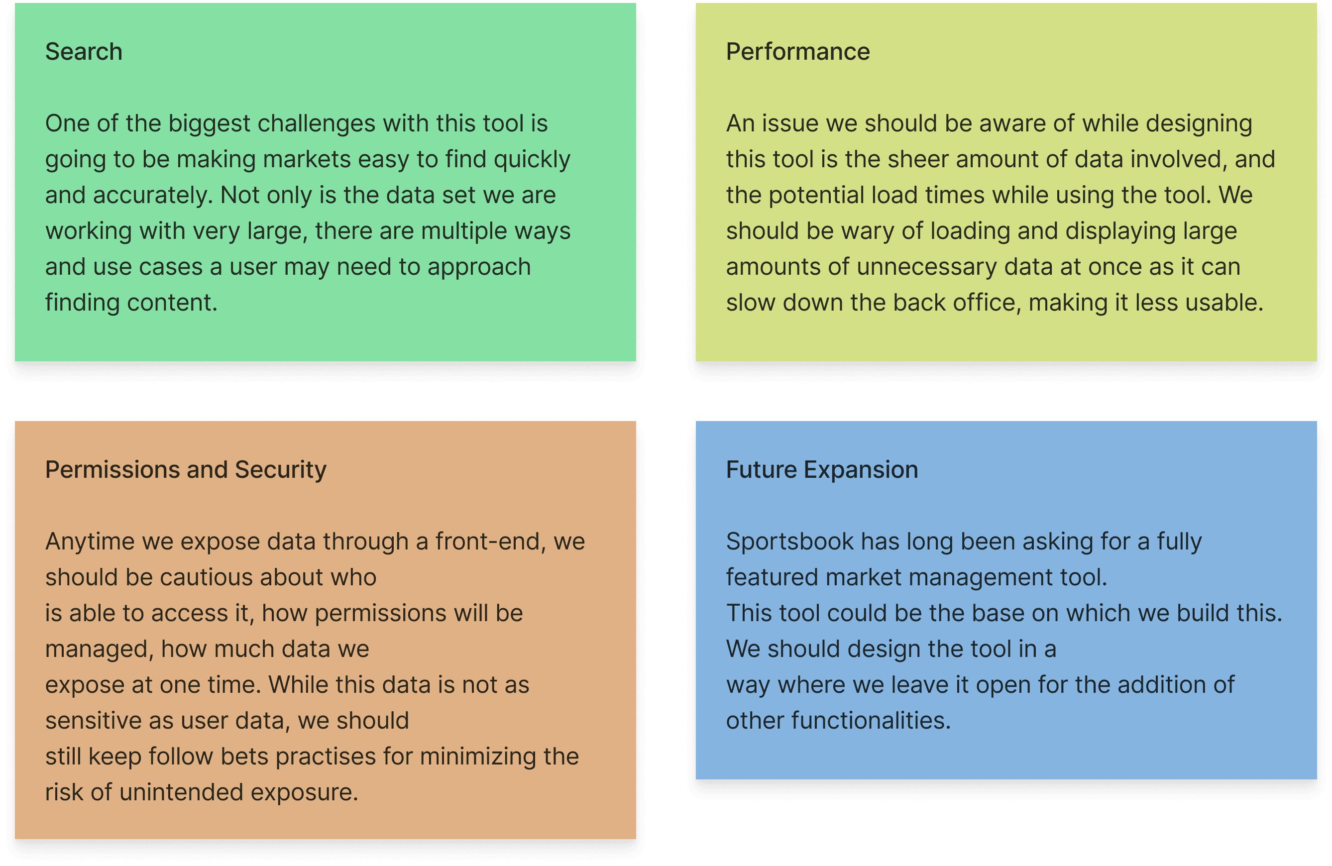
We decided we needed a new software tool that Sportsbook teams could use. How might this work?
Key Considerations & Obstacles
After this we identified potential obstacles.
Functional Requirements
Next we started to ideate on the functions this tool might have.
Search Markets
Searching the content that is in a pages categories
Edit Tags
Choose which content and categories appear on a page
Edit Market Blocking
Changes category names & content within
Edit Display Rank
Changes order that categories appear
Edit Format
Changes UI of the content in categories
Design Foundation
User Flows
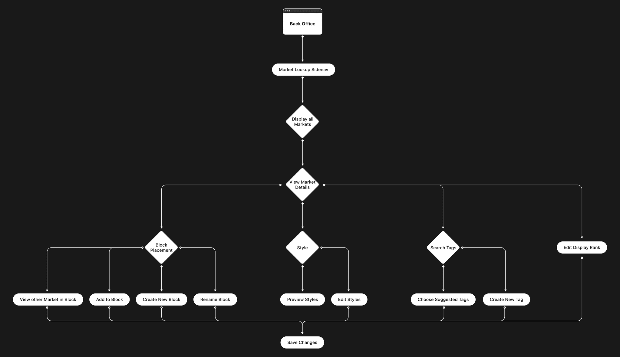
We mapped out the user journeys. This really helped us understand what would need to be in which area of the layout. It helped us visualize which task journeys that should be close together on the page.
Wireframes
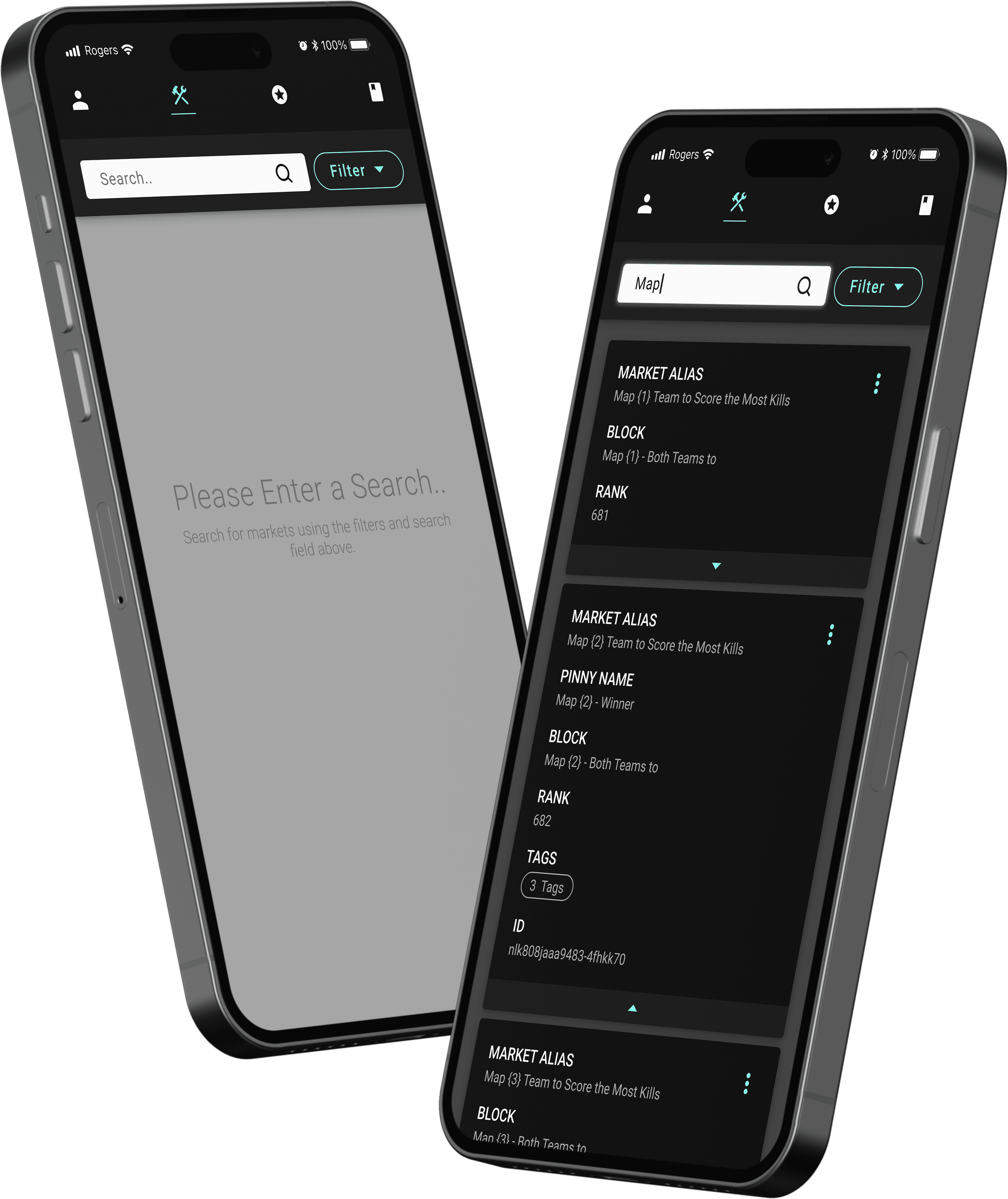
I started with hand drawn wireframes. After that I digitized the wireframes. This was great for quick brainstorming of ideas. It helped us come up with some different interactions that could work for this tool. It's also a great way to align with other departments on how the tool should work. It helps people not get wrapped up in the visuals of a project too early. People can focus on how the tool actually works instead of how it looks.
Obstacle: Market Ranking System

Our problem- if a piece of content is moved to a different rank and another piece of content already occupies that spot, the moved content will move below the content that was previously there. Meaning the new content will be placed beneath it. This doesn’t sound like such a problem until you introduce the fact that there is 350+ markets, and they’re all occupying only 16 ranks.
Aligning Stakeholders
Even if we built the tool and it could move ranks, it still would have very bad granularity and be very confusing to use, defeating the purpose of the tool. We needed a fifth value to be added
Not all of our stakeholders agreed that this problem was worth solving. Some thought that dev time was not worth investing in to make the user experience better. I then created prototypes and tested them with users, to prove that this was worth doing.
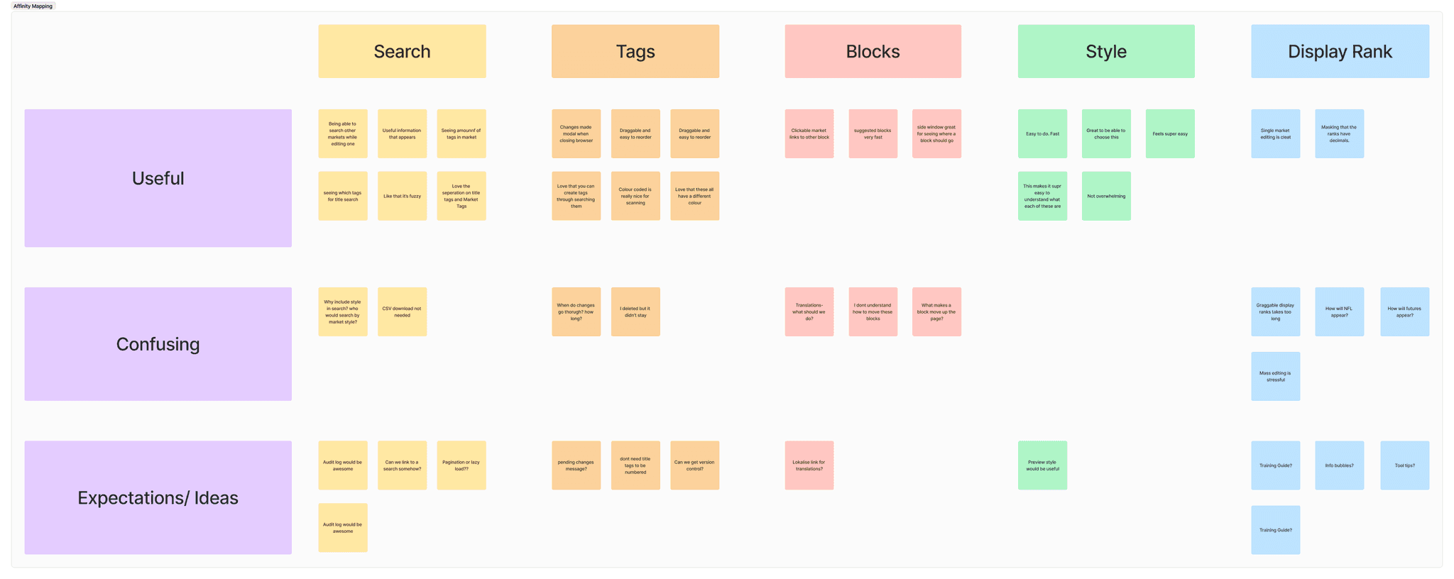
The feedback shown above, Is what I collected. The feedback showed that it was crucial to add a fifth value and to simplify / translate the ranks to have no decimals.
Solution:
Decrease Cognitive Load
We added a fifth value. This gives granularity to our ranking system without completely reordering all the markets in the process.
For the user facing side, I asked the Front-end devs to translate the market rankings into a single value with no decimals. This decreased cognitive load.
Usability Testing
Affinity Mapping
Next we made a usable prototype. I ran usability tests with the Sportsbook team to ensure that the functionality of our tool was solid. We learned a lot doing this. For example the mass editing function that was originally requested on the tool, was overwhelming for the users. We decided to scrap it, as it was pretty hard on the performance of the tool anyway.
Design System
We leveraged our recently rebuilt internal tooling design system. Pictured below is part of the system. In this slide you can see the primitive palette, elevation, spacing scale, and typescale. Testing contrast was exciting. Contrast is very important for usability. I really enjoy the work that was done on the colour system at Goldman Sachs. Check it out here if you're curious.
Hi-fi Screens
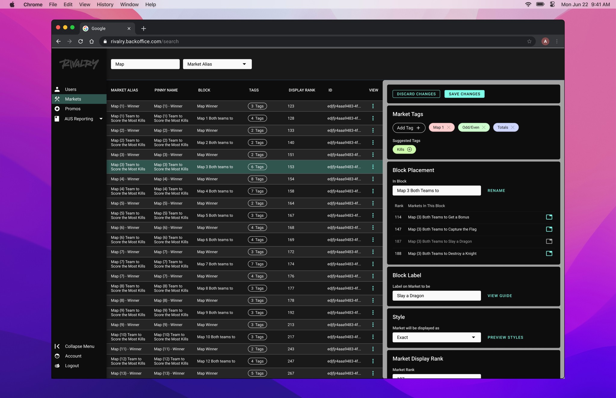
After we finished implementing changes from our usability sessions, we turned our lo-fi screens into hi-fi screens.
Results: Measuring ROI
100%
Decrease in Dev output
There have been zero requests submitted to Devs
5 / 5
Software User Satisfaction
Measured through surveys
What People Said
These were some of the things that the team that use this tool said about it.
"This has been one of the best implementations we've done so far, given the extensive range of functions and seamless operations." - Piero (Senior Compiance Analyst)
"Everything is working flawlessy, which is remarkably impressive." - Lucas (Senior Compliance Analyst)
"Again, literally couldn't be easier to use. The tool is 🔥" - Dan (Sportsbook Manager)
"A. A. Ron is the mastermind behind it all" - Sydney (Product Manager)
Learnings
This project really reinforced for me how important documentation and communication is. I had absolutely no documentation when approaching this project. Which meant that I had to investigate the back-end workings and obstacles in greater detail. This can be hard to do when you are communicating with other departments who do not share common ground in a certain skill base. For example, the back-end devs, aren't designers, and I'm not a back-end dev. This meant we had to try to forget our tech terms, and focus on communicating in a way that was simple and to the point.
This is something I will bring into all my projects. An ease in communication makes work easier to understand and solutions quicker to find.

